


















 Shopping guides
 Help
 Log in

Colour psychology in decoration: what each colour communicates.
Article index
The psychology of colour in decoration is a fascinating topic that reveals how colours influence our emotions and perception of a space. Have you ever felt more relaxed in a blue room or more dynamic in a red environment? It's no coincidence; colours can affect our mood and behaviour, transforming the atmosphere of any place. In this article, we will explore how to choose the right palette to create harmonious environments in your home or workspace, adapting them to your needs and emotions.
Why do the colours used in decoration evoke feelings?
Colours influence our emotions and behaviour. Since ancient times, they have been used strategically, and modern psychology confirms their impact. Warm tones, such as red and orange, evoke energy and passion, while cool tones, like blue and green, convey calmness and serenity. Our brain associates them with past experiences, making them key tools for enhancing well-being, productivity, and the atmosphere of a space.

What does each colour convey?
Red
Red is a vibrant colour associated with passion, energy, and action. In decoration, it brings dynamism, making it ideal for gyms or creative offices. However, excessive use can generate stress, so it is better to use it in details like cushions, paintings, or small furniture.
Blue
Blue is a relaxing colour that conveys tranquility and serenity, making it ideal for bedrooms or meditation rooms. It also symbolises trust and stability, being common in offices. However, dark tones can seem cold if not combined with warm shades.
Green
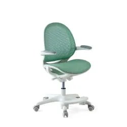
Green, a symbol of nature, brings freshness, balance, and harmony. It promotes emotional well-being and concentration, making it ideal for living rooms and offices. In large spaces, it is better to opt for soft tones to avoid monotony.
Yellow
Yellow symbolises happiness, creativity, and optimism. It brightens and warms spaces, making it ideal for kitchens and studies as it stimulates productivity. In excess, it can generate anxiety, so it is better to balance it with neutral or soft tones.
Orange
Orange, a combination of red and yellow, conveys energy and enthusiasm. Ideal for dining rooms and entertainment areas, it fosters creativity and social interaction. Too much orange can be overwhelming, so it is advisable to apply it in details or specific areas.
White
White means purity, cleanliness, and simplicity, adapting to any decorative style. It expands and brightens small spaces, but in excess, it can seem cold or impersonal. To balance it, it is advisable to combine it with warm tones or colour accents.
Grey
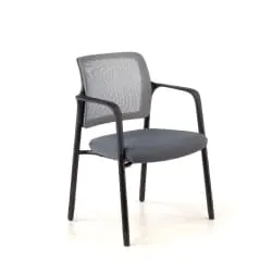
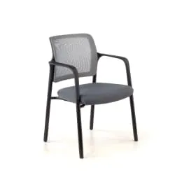
Grey, a neutral tone that evokes balance, sophistication, and calm, is ideal for modern offices and living rooms. Its versatility allows it to be easily combined with other colours, adding elegance and professionalism. However, excessive use can induce monotony or sadness, so it is recommended to balance it with vibrant accents, such as yellow or red, to inject vitality into the space.

How to use colours effectively in decoration
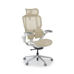
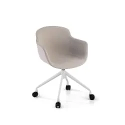
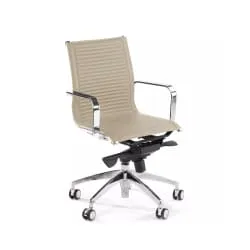
If you are looking for inspiration choosing furniture and colours, take a look at options like beige desk chair for a warm and cosy office or explore the different wood colours to create a natural and relaxing atmosphere.
Having explored the effects of each colour, here’s how to apply them effectively in your décor:
- Opt for soft tones in rest areas: For relaxing bedrooms or living rooms, choose colours like blue, green, or grey, which promote calm and well-being.
- Add warmth to social areas: In kitchens, dining rooms, or living rooms, warm tones like red, orange, and yellow generate energy and encourage interaction.
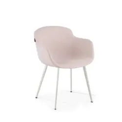
- Don’t underestimate accents: Sometimes, it is not necessary to paint an entire wall in a bold colour. Using small details like cushions, rugs, or a desk chair in a specific colour can completely transform the atmosphere without overwhelming the space.
- Balance cool and warm colours: If cool tones like blue or green predominate, combine them with natural wood or terracotta tones to avoid an impersonal feel.
- Adapt colours to the purpose of the space: In offices, blue and green favour concentration, while in creative or social areas, red and orange stimulate activity.
The psychology of colour is a key tool for transforming spaces based on our emotions and needs. The next time you redecorate, remember that colours not only decorate but also create sensations.


